Inspiration by Daniel Voigt Godoy’s books
Linear regression
import platformimport numpy as npimport pandas as pdimport matplotlib.pyplot as pltimport seaborn as snsimport torchimport torch.optim as optimimport torch.nn as nnfrom torch.utils.data import TensorDataset, DataLoaderfrom sklearn.linear_model import LinearRegressionfrom sklearn.model_selection import train_test_splitfrom shared.step_by_step import StepByStepfrom scipy.linalg import normfrom torchviz import make_dot'fivethirtyeight' )
The autoreload extension is already loaded. To reload it, use:
  %reload_ext autoreload
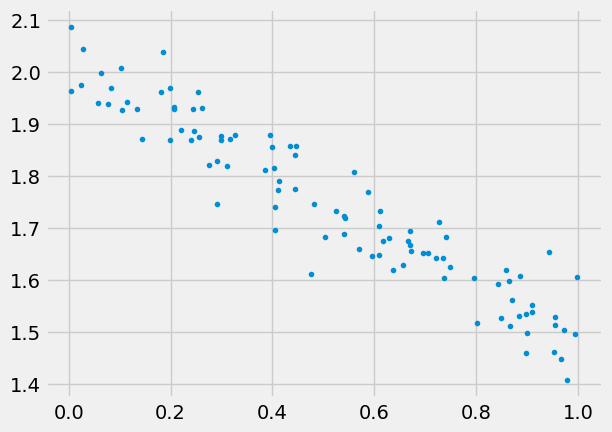
Generate some data
we’ll use numpy for this, and also need to split the data, can also use numpy for this
43 )= 2. = - 0.5 = 100 = np.random.rand(N,1 )= 0.05 * np.random.randn(N,1 )= w_true* x + b_true + epsilon'.' )
Linear regression with sklearn
Of course we can make a fit using sklearn:
= LinearRegression().fit(x, y)= reg.score(x, y)print (reg.coef_, reg.intercept_, r2_coef)
[[-0.52894853]] [2.01635764] 0.9014715901595961
but the point is to learn PyTorch and solve much bigger problems.
Create datasets, data loaders
data set is the object that holds features and labels together,
split the data into train and valid,
convert to pytorch tensors,
create datasets,
create data_loaders.
43 )= np.arange(N)= indices[:int (0.8 * N)]= indices[int (0.8 * N):]= 'cuda' if torch.cuda.is_available() else 'cpu' = torch.tensor(x[train_indices], dtype= torch.float32, device= device)= torch.tensor(y[train_indices], dtype= torch.float32, device= device)= torch.tensor(x[val_indices], dtype= torch.float32, device= device)= torch.tensor(y[val_indices], dtype= torch.float32, device= device)= TensorDataset(train_x, train_y)= TensorDataset(val_x, val_y)= DataLoader(train_dataset, batch_size= 16 , shuffle= True )= DataLoader(val_dataset, batch_size= 16 )
Model, loss, and optimizer
42 )= torch.nn.Linear(1 ,1 , bias= True , device= device)= optim.SGD(model.parameters(), lr= 0.1 )= nn.MSELoss()
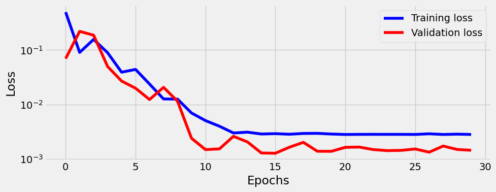
Train
= StepByStep(model, optimizer, loss_fn)30 )
OrderedDict([('weight', tensor([[-0.5267]])), ('bias', tensor([2.0177]))])
Note btw that alex and sbs.model are the same object:
assert id (sbs.model) == id (model)
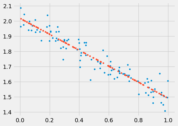
Predict
= np.random.rand(100 ,1 )= sbs.predict(test)'.' )'.' )
Save/load model
'linear.pth' )
'linear.pth' )
Visualize model
One can use make_dot(yhat) locally. I can’t make graphviz work on GitHub, but the output looks like this:
Set up tensorboard
One can add tensorboard to monitor losses, this will be important when having long training. We can start tensorboard from terminal using tensorboard --logdir runs (or from notebook if using extension via %load_ext tensorboard). The tensorboard should be running at http://localhost:6006/ (ignore "TensorFlow installation not found" message, we don’t need it). Make sure path is right, tensorboard will be empty if it can’t find the runs folder.
Tips dataset
Let’s study the linear regression model from classical perspective. Let’s load a tips dataset where independent variables are: total_bill, sex, smoker, day, size, time, and depended variable is tips. First we simplify model by keeping only 1 independed variable, total_bill:
# Load the dataset = sns.load_dataset("tips" )
0
16.99
1.01
Female
No
Sun
Dinner
2
1
10.34
1.66
Male
No
Sun
Dinner
3
2
21.01
3.50
Male
No
Sun
Dinner
3
3
23.68
3.31
Male
No
Sun
Dinner
2
4
24.59
3.61
Female
No
Sun
Dinner
4
Let’s split the data:
= train_test_split(tips, test_size= 0.2 , random_state= 42 )
= (20 ,12 ))= sns.heatmap(train.corr(numeric_only= False ), cmap= "seismic" , annot= True , vmin=- 1 , vmax= 1 , fmt= '.1f' ,square = True )
---------------------------------------------------------------------------
ValueError Traceback (most recent call last)
Cell In[188], line 2
1 plt.subplots(figsize=(20,12))
----> 2 a = sns.heatmap(train.corr(numeric_only=False), cmap="seismic", annot=True, vmin=-1, vmax=1, fmt='.1f',square = True)
File ~/mambaforge/envs/website/lib/python3.10/site-packages/pandas/core/frame.py:10307 , in DataFrame.corr (self, method, min_periods, numeric_only)
10305 cols = data.columns
10306 idx = cols.copy()
> 10307 mat = data.to_numpy(dtype=float, na_value=np.nan, copy=False)
10309 if method == "pearson":
10310 correl = libalgos.nancorr(mat, minp=min_periods)
File ~/mambaforge/envs/website/lib/python3.10/site-packages/pandas/core/frame.py:1843 , in DataFrame.to_numpy (self, dtype, copy, na_value)
1841 if dtype is not None:
1842 dtype = np.dtype(dtype)
-> 1843 result = self._mgr.as_array(dtype=dtype, copy=copy, na_value=na_value)
1844 if result.dtype is not dtype:
1845 result = np.array(result, dtype=dtype, copy=False)
File ~/mambaforge/envs/website/lib/python3.10/site-packages/pandas/core/internals/managers.py:1770 , in BlockManager.as_array (self, dtype, copy, na_value)
1768 arr = arr.astype(dtype, copy=False)
1769 else:
-> 1770 arr = self._interleave(dtype=dtype, na_value=na_value)
1771 # The underlying data was copied within _interleave
1772 copy = False
File ~/mambaforge/envs/website/lib/python3.10/site-packages/pandas/core/internals/managers.py:1829 , in BlockManager._interleave (self, dtype, na_value)
1823 rl = blk.mgr_locs
1824 if blk.is_extension:
1825 # Avoid implicit conversion of extension blocks to object
1826
1827 # error: Item "ndarray" of "Union[ndarray, ExtensionArray]" has no
1828 # attribute "to_numpy"
-> 1829 arr = blk.values.to_numpy( # type: ignore[union-attr]
1830 dtype=dtype,
1831 na_value=na_value,
1832 )
1833 else:
1834 arr = blk.get_values(dtype)
File ~/mambaforge/envs/website/lib/python3.10/site-packages/pandas/core/arrays/base.py:513 , in ExtensionArray.to_numpy (self, dtype, copy, na_value)
482 def to_numpy(
483 self,
484 dtype: npt.DTypeLike | None = None,
485 copy: bool = False,
486 na_value: object = lib.no_default,
487 ) -> np.ndarray:
488 """
489 Convert to a NumPy ndarray.
490
(...)
511 numpy.ndarray
512 """
--> 513 result = np.asarray(self, dtype=dtype)
514 if copy or na_value is not lib.no_default:
515 result = result.copy()
File ~/mambaforge/envs/website/lib/python3.10/site-packages/pandas/core/arrays/_mixins.py:85 , in ravel_compat.<locals>.method (self, *args, **kwargs)
82 @wraps(meth)
83 def method(self, *args, **kwargs):
84 if self.ndim == 1:
---> 85 return meth(self, *args, **kwargs)
87 flags = self._ndarray.flags
88 flat = self.ravel("K")
File ~/mambaforge/envs/website/lib/python3.10/site-packages/pandas/core/arrays/categorical.py:1609 , in Categorical.__array__ (self, dtype)
1607 ret = take_nd(self.categories._values, self._codes)
1608 if dtype and not is_dtype_equal(dtype, self.categories.dtype):
-> 1609 return np.asarray(ret, dtype)
1610 # When we're a Categorical[ExtensionArray], like Interval,
1611 # we need to ensure __array__ gets all the way to an
1612 # ndarray.
1613 return np.asarray(ret)
ValueError : could not convert string to float: 'No'
= train.total_bill.values.reshape(- 1 ,1 )= train.tip.values.reshape(- 1 ,1 )= valid.total_bill.values.reshape(- 1 ,1 )= valid.tip.values.reshape(- 1 ,1 )
((195, 1), (195, 1), (49, 1), (49, 1))
sklearn.LinearRegression
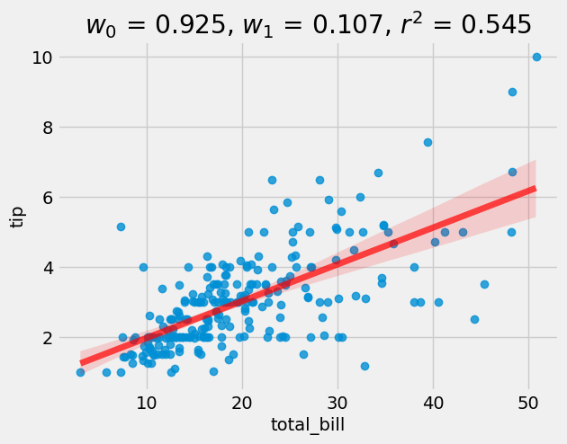
Let’s first use very simple linear regression model from sklearn, and only 2 columns:
= LinearRegression()= lr.score(X_valid, y_valid)= tips, x= "total_bill" , y= "tip" , line_kws= {"color" :"r" ,"alpha" :0.7 ,"lw" :5 })f'$w_0$ = { float (lr.intercept_):0.3f} , $w_1$ = { float (lr.coef_):0.3f} , $r^2$ = { r2:0.3f} ' )
So we see that on average people left 10.5% tip. The r2 score is 0.597.
Manual
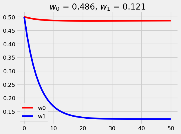
= 0.5 = 0.5 = len (X_train)= 2e-4 = [w0]= [w1]for i in range (50 ):= w0 + X_train* w1= 1 / N * np.sum ((y_new - y_train)** 2 )-= alpha* (1 / N * 2 * np.sum (y_new - y_train))-= alpha* (1 / N * 2 * np.sum ((y_new - y_train)* X_train))= range (len (w0_list)), y= w0_list, color= 'red' , label= 'w0' )= range (len (w1_list)), y= w1_list, color= 'blue' , label= 'w1' )f'$w_0$ = { w0:0.3f} , $w_1$ = { w1:0.3f} ' )
Interesting that w1 is slightly off 12.1% vs 10% (regularization is not a culprit). Let’s plot together with the scatter plot:
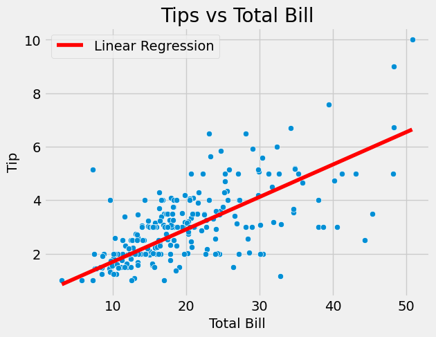
# Create scatterplot = "total_bill" , y= "tip" , data= tips)# Add title and axis labels "Tips vs Total Bill" )"Total Bill" )"Tip" )# seaborn plot a line = X_train.flatten(), y= w0 + w1* X_train.flatten(), color= 'red' , label= 'Linear Regression' )# Show the plot
Multivariate linear regression
Let’s now include all variables:
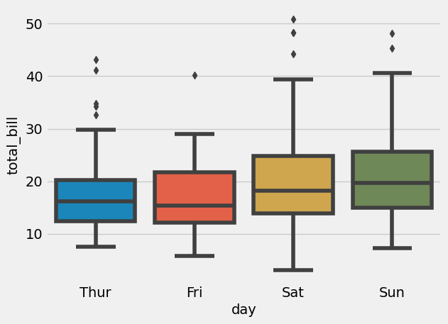
= sns.boxplot(x= "day" , y= "total_bill" , data= tips)
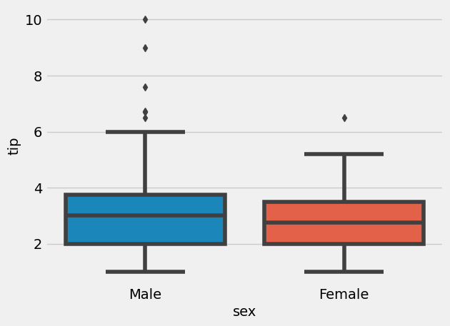
= sns.boxplot(x= "sex" , y= "tip" , data= tips)
This graph might not mean males are bigger tipers, since it might have been that more males ate in bigger groups as well. Plotting relative tip (i.e. tip/total_bill) might be more informative:
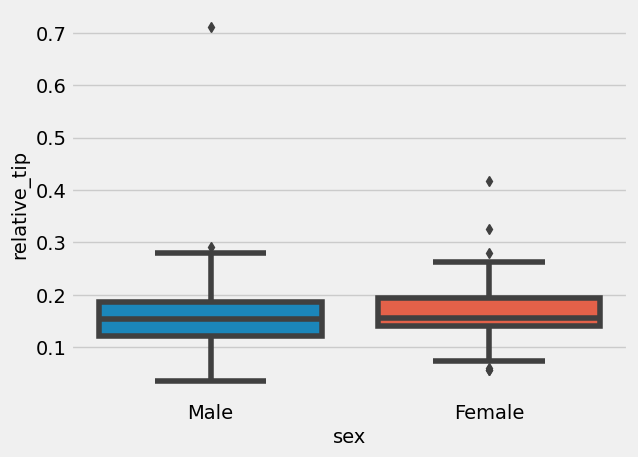
'relative_tip' ] = tips['tip' ] / tips['total_bill' ]= sns.boxplot(x= "sex" , y= "relative_tip" , data= tips)
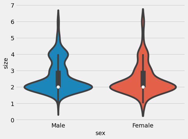
Indeed, women left larger percentage of tip (then again, they might have had smaller portionsl there are many angles one can look at this data). How about compare group sizes:
= sns.violinplot(x= "sex" , y= "size" , data= tips)
That seems very similar distribution.
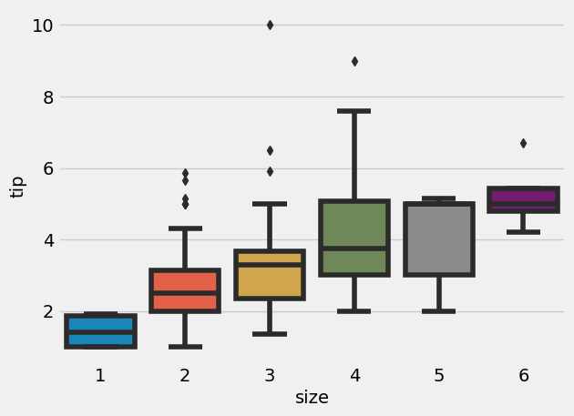
= sns.boxplot(x= "size" , y= "tip" , data= tips)
Multivariable linear regression
Let’s run multivariable linear regression, we first need to encode all the categorical variables into numerical:
total_bill     float64
tip            float64
sex           category
smoker        category
day           category
time          category
size             int64
dtype: object
228
13.28
2.72
Male
No
Sat
Dinner
2
208
24.27
2.03
Male
Yes
Sat
Dinner
2
96
27.28
4.00
Male
Yes
Fri
Dinner
2
167
31.71
4.50
Male
No
Sun
Dinner
4
84
15.98
2.03
Male
No
Thur
Lunch
2
= pd.get_dummies(train, columns= ["sex" ], prefix= "sex" )= pd.get_dummies(train_n, columns= ["smoker" ], prefix= "smoker" )= pd.get_dummies(train_n, columns= ["time" ], prefix= "time" )= pd.get_dummies(train_n, columns= ["day" ], prefix= "day" )
= pd.get_dummies(valid, columns= ["sex" ], prefix= "sex" )= pd.get_dummies(valid_n, columns= ["smoker" ], prefix= "smoker" )= pd.get_dummies(valid_n, columns= ["time" ], prefix= "time" )= pd.get_dummies(valid_n, columns= ["day" ], prefix= "day" )
= train_n.drop('tip' , axis= 1 ).values= train_n.tip.values.reshape(- 1 ,1 )= valid_n.drop('tip' , axis= 1 ).values= valid_n.tip.values.reshape(- 1 ,1 )
((195, 12), (195, 1), (49, 12), (49, 1))
Let’s train the model:
= LinearRegression()
array([[ 0.09469974,  0.23348393,  0.01440964, -0.01440964, -0.09617663,
         0.09617663,  0.04747858, -0.04747858, -0.07564606,  0.10407492,
        -0.08171038,  0.05328153]])
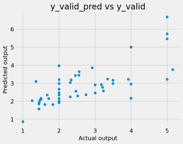
and these are the coefficients. Let’s predict on valid dataset:
= lr.predict(X_valid)
and let’s plot the predicitons and targets:
# write a code to plot y_valid_pred vs y_valid 'Actual output' )'Predicted output' )'y_valid_pred vs y_valid' )
Measure of accuracy is R^2 (i.e. coefficient of determinaltion):
= lr.score(X_valid, y_valid)
Which is the same as:
= ((y_valid_pred - y_valid)** 2 ).sum ()= ((y_valid - y_valid.mean()) ** 2 ).sum ()1 - u/ v
And this is worse then univariable linear regression, meaning that in case of LinearRegression adding other variables made predictions worse.